Content

Network

Showing posts with label sketch. Show all posts
1 Cups of tea...

"Whispers from Forbidden Earth" by Mark Venturini


Is a tween fantasy novel being released through Helping Hands Press, written by Mark Venturini.  I could try to express how excited I was to get a contact about doing some spot illustrations, but I'd probably fail to do so adequately.  Illustration, especially of fiction, has always been a big influence on my life goals, so the opportunity to do so was A+.

Mark was very clear from the outset that he wanted something in black-and-white as well as something that looked sketchy.  The spots would be at the chapter starts, and they needed to have an edge treatment to match other work he already had.  He's a great client- good communication back and forth, clear wants and direction, succinct suggestions about what would make him happy and open to interpretation and artistic leeway in seeing the job done to both parties satisfaction.

A couple sketches mocked up for the troll at the bridge.  The assignment was a ruined bridge in a meadow at night. The stony troll, wearing simple braes with optional tunic, should hold a magic staff.  In the sketches you can see that I put the bridges over water, which was incorrect.  Mark's troll bridges do not go over water, despite being paths to other places.  I was playing around with where to put the troll so that he would be visible to a reader.  The spots are fairly small, but which side the troll is on commands if he looks ominous or not.

Dark figure in an alley...   This one was pretty quick and simple, the key was making it look properly sketchy and populated while not distracting attention from the figure.  It was also an evening deal, so lighting was tricky.  Thanks to growing up with the Batman Animated Series, I did know that night scenes are lit from the bottom up.

The final on the troll and his bridge (not over water) !   The lights on the far hills are campfires, ostensibly from other trolls and bridges?  Rocks of the fallen bridge dot the meadow grasses.  


1 Cups of tea...

Graphic Murals - Seiryuu vs. Suzaku

I had a mural commission for a full living room.  The inspiration piece I was shown was an early 1900s japanese-revival china hutch, black wood with gold inlay and tiny red depictions of people going about their days.  The hutch is in the dining room, and the client wanted the living room to be bold, a conversation piece, and tied to that furniture piece somehow.  Went with colours and themes - two of the directional kami being the blue dragon, Seiryuu, and the red phoenix, Suzaku, both over a parchment ground with blown gold flakes.  I did a few different kinds of dragons and phoenixes, since everyone has different taste on how body shapes and faces look.  I was especially excited to put the claw near the light switch like Seiryuu might play with the lights, as well as the lost and found scale coils coming all the way down the stairs.

Painting was about 2.5 weeks with only Windsor Guest and myself painting, mostly in drying time.  The parchment effect on the walls was achieved with pushed oil washes, then drawing the figures and painting them in acrylics, and finally a guarding matte clear coat over everything so that the client could still wash the walls and have a clean house.


0 Cups of tea...

Storyboarding - Pyotr


Peter the Great

An idea taken from poetry about Peter the Great.  I fell in love with an animated Bayeux Tapestry that was produced created by students at Goldsmiths College.  Old media and old stylizations of people or characters coming to life to tell their story.  Presented with an excerpt from a poem, then, I went with this as a planned cut scene of a tapestry Peter coming to life as his story was told. Altogether the piece would run a minute.


0 Cups of tea...

Global Game Jam 2013

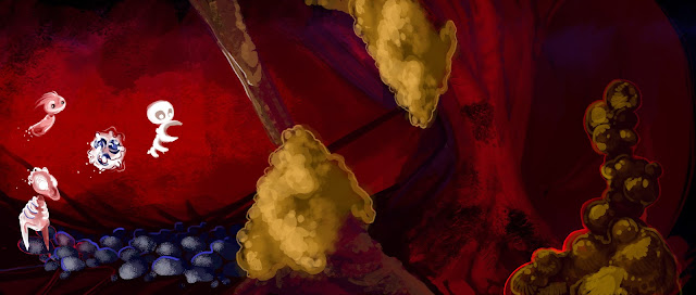
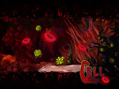
This was a concept paint of the environment "Heart Chamber" where the boss would be encountered.  I was focusing on clear materials definitions for the environment artists, suggestion of propulation assets, and clarification of the red blood cell powerups and the virus mine enemies.  It was done wholly in photoshop, in about 3 hours.  Later, after I made the Cell logo text, I converted the paintup to a 'wallpaper' format as you see here. 


It happened January 25th- 27th, so I'm a little late in posting up the meaty bits associated with the efforts.  Reasons?  Doing a 48 hour event pushed a lot of things behind by about 48 hours!  After that there's been some family medical emergencies, and work that is under NDA....but I've been noodling away. 

If you every get a chance to do a GGJ, do it.  Anyone is welcome, anyone interested in game production at all.  There were even two boys, 13 and 14 I think their ages were, at the Pittsburgh location who set out to code an entirely text based team.
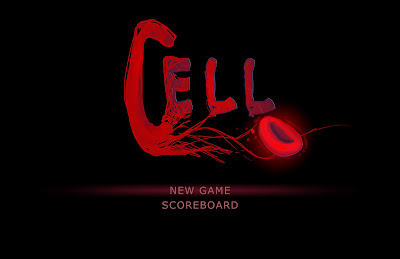


This concept was trying to feel out the opening menu screen and whether we wanted custom font or just to use a premade font.  We liked the effect, animated the blood cell throbbing with a heartbeat sound, and went with it.


I took on the role of Producer for an outstanding team, as well as a Concept Artist, Game Designer and Texture Artist.  Producer meant collecting files and holding meetings, being the final decider on directions discussed, keeping everyone to deadlines, and most of all keeping cool, calm and collected while encouraging team enthusiasm and health.  By the end, concept and UI work complete,  I was putting blankets over sleeping teammates and telling others when they'd been working for more than 2 hours straight to stand and have a 5 minute walk and water break.


Our Team logo, NoBrows.  It's a stylized portrait of Travis.  Apparently at some point he'd lost a bet and shaved his eyebrows as a result long prior in history.  So our team wagered him his eyebrows if we won any awards.  It became a running joke over the event, and the logo was a surprise to get him and everyone to laugh.  It worked well.  Sadly, he still has his eyebrows in real life.

Some early iterations of White Cell's design over top of a vein/artery environment concept.  With only 48 hours, I was trying to cut down by combining the environment, propulation and character on one piece.

My excellent, talented teammates were  - Amanda Wallenhorst, Jordan Jenkins, Cody Wilcoxon, Matthew Kline, Travis Kehler, Kyle Hickey, and Theresa Liddington.  This year's theme was a heartbeat, and we had decided early on that we wanted to make a side-scroller in the Unreal Development Kit.  Cue the canonball run collection adventure of White Cell, who fights to free your heart from the grip of Cardiovascular Disease. W, S, A, & D guide the character along the environment to collect red blood cell power ups, and players have to be careful to avoid the exploding viral mines.  The product came out beautifully polished for 48hours and 8 sleep deprived artists, and everyone who played it commented on that aspect. 
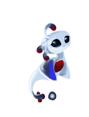


Our Stylized main protagonist, White Cell.  


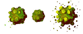
The enemy virus mines and some indication of how they should animate to the skinning/rigging team.

We discussed wanting to maybe spend another week jam session on it as a group, figuring if we got that far in 2 days, a dedicated 7 might allow us to push in a projectile attack, some other interesting enemy variants, expand the 'boss battle' and have more than one level.  I really hope we can organize it together.  As the Producer, I suppose that will be in my court to start emailing everyone!

In the meantime, All GGJ participants upload their source files and playables to the GGJ site, and agree to released them under Attribution-Noncommercial-Share Alike 3.0 version of the Creative Commons License. So go play our game, Cell, as well as all the other amazing 48-hour free vignettes created by this amazing event!
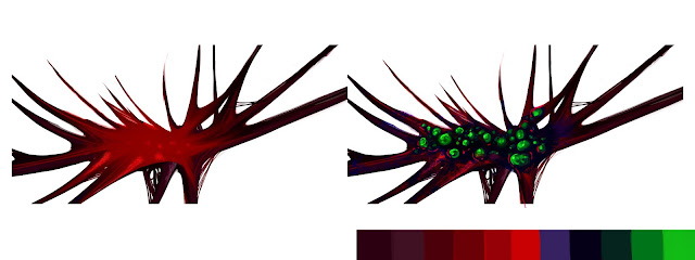
The base palette we decided to use as well as a prop concept in a infected and non-infected state of texture swap.


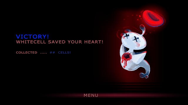
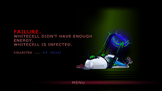
Spoiler?  WhiteCell is based on a basophil immune cell, so win or loose, he has excreted his defensive chemicals to poison/eat the enemy and perishes.  Its a glorious sacrifice to save the body and become a hero.  If he loses....poor thing gets infected.

We even had suggestion that we should have WhiteCell plushies made, with the hole in their body still there, looking cute and gore. It was great people got into the ambiance and feel so much, and really liked the style.


0 Cups of tea...

Escape from NIMH III - Environment Thumbnails


Some basic thumbnails for environments in the previsual development.  The plan for the game progression is NIMH labs > NIMH Labs duct work > Forest > Derelict Truck > Forest > Fitzgibbon Farm > Establish the Rose Bush Colony. 

These were a mix of Alchemy, Photoshop and traditional copic marker on graphics paper.


The lower left thumbnail actually shows the theoretical grating that the rats woudl exit out into the forest from.  This is the door that would have been impassible were it not for the help and survival of Mr. Ages and Johnathan.

The Derelict Toy Truck with the dead toymaker inside.  This is what provides the rats with their rat-sized tools and would be a beginning equipment pool and skills/learning level up station for the rats as they discovered some books here to read.


I need to study more farm houses and farm equipment.  Neither of these really takes into account barn structures.  But they do start considering the location of the rose bush on the front lawn of the property as well as showing off the tiller that later is important to Mrs. Frisby.
So I'll need to start converting these to color studies and tightening up the forms and lighting and propulation. 

0 Cups of tea...

Modus Operandi III


Modus is moving along nicely.  My position as a consultant to the project development is winding down along with my final days of my degree here at the Art Institute of Pittsburgh and 7th Level Studios.  Supposedly next quarter will be the last 11 weeks of development for the demo, so I'll have to keep in touch and  keep an  eye on the final stages and product.  In the meantime, here's some more of what I've been up to.

Lets start it off with the loose Demo - Experience Storyboards:


Much of the rest of the concept team wasn't comfortable with vehicles, so I took on the scrum tasks of the general Metropolitan Police cars and the Armed Response/Detective car that woudl be specialized to the main character, Peter Morris.  Silhouettes went through two phases, and then turn-arounds with colour.  The most exciting aspect was that Ben Mathis, a well known industry freelancer of this website, was visiting to give a presentation and stayed for the Studio Class afterwards.  He came over and gave some feedback and critique on the general vehicle, suggesting the incorporation of the foot-divot in the rear wheel hood/well and the defined running board. 

Using Alchemy & Photoshop

Using Alchemy & Photoshop

The magic of Photoshop

Utilizing Photoshop.  This one had the helpful critique by Ben Mathis.  He even recognized it as a retro-futuristic smart car inspired silhouette~


0 Cups of tea...

Escape From NIMH I - Previsual Art Book


The Logo needs a little love still, but that's back burner to getting the content done.  This is a personal project for pre-pre-portfolio (only I've already had pre-port and am in portfolio now).  A prequel Visual Development Artbook to the 1982 animated film directed by Don Bluth, The Secret of NIMH, based on  Robert C. O'Brien's 1971 children's novel "Mrs. Frisby and the Rats of NIMH".

The prequel will focus on the escape and founding of the society of rats in Rose Bush while introducing the political intrigue and growth of polarization of power between the leaders: Nicodemus, Jenner, Justin, Mr. Ages and Johnathan.

The plan is to format it something similar to what Scott Robertson guided his students at the Art Center College of Design in Pasadena, California,  Khang Le, Mike Yamada, and Felix Yoon to do in their "The Skillful Huntsman."  Granted, there were three students there and they had 14 weeks to produce really amazing work.  I'll have been just me, and essentially 8 weeks to have enough time to then try to throw it together to some sort of 'book'.  But goals are good and this is something I can work on and refine even past graduation.

Mr. Ages, one of the two surviving mice.

Jenner, the eventual villain of the movie.  He has to appear aggressive and more tending towards violence, but at this point he is still very much part of the brotherhood and group effort.


I started out with character silhouettes, utilizing Alchemy because it really forces straight up plowing forward-there's no undo.  There's not really any layers.  What will be evident, is that at first I was spending (wasting?) a lot of time redrawing the silhouette for each outfit design.  In some cases that would be very helpful, but the basic character shapes for this project are predetermined to the Bluth property/designs.  They have to be recognizable.  So one silhouette and a lot of outfit designs was really what I needed.   Then I discovered the 'Load Background Image' in Alchemy....and felt like a total noodle.  So later design sheets have standardized main silhouettes with focus on the outfit and breaking of the silhouette.  

 
Johnathan Frisby, the other of the two mice that survived.  He's supposed to look inquisitive and friendly.  Throughout the book "The Rats Of NIMH", the mice prove themselves the most generous and heroic of characters compared to the somewhat isolationist and (some might argue) facist practices of the Rats.  Additionally, Johnathan dies later in the story, so it is important that he be instantly readable and relatable- able to be enjoyed and understood by a player.

Justin, eventual captain of the guard.  Some military elements need to show through, as do his sense of honor and his youth this early on.

Nicodemus, the leader of the Rats.


During the pre-production and scripting phases of the Secret of NIMH, Don Bluth and his fellows encountered the problem inherent with the Shapeshifter as a Mentor of the Hero’s Journey – they know everything.

A  character who has all the answers destroys the tension in a plot or the sense of uncertainty.
The solution they found the solution to this in their voice actor, Derek Jacobi.  He focused his readings on Nicodemus’ time in the labs.  It drew the focus of the character’s on screen time to the mystery of who he was rather than all the answers he could provide – therefore providing a mirror and possible foil or foreshadowing to Brisby’s own trials of self discovery and growth of courage.
(Don Bluth’s The Art of Animation, p.34 May 2005)


For my own purposes this approach to the character is important to know as the prequel will start with the escape from NIMH itself.   While still a leader, Nicodemus is no longer a ‘mentor’ character, but is at the beginning of his own journey.  This will need to be reflected in the concepts – he’s in his prime, he’s intellect and wisdom without worldly experience, and therefore he is fallible.  
0 Cups of tea...

Modus Operandi II


A combination look at some of the pre-production designs from when we were ramping down on DGPX and stull trying to hammer out the story and theme elements of Modus, as well as the beginning of style examples, then character and NPC designs. 


Followers

Labels

concept (17) sketch (15) character (12) design (11) Rough (10) game (8) environment (6) props (6) competition (5) commission (4)
Art © Kit McLellan. Powered by Blogger.

About Me

Illustrator, writer, and gamer (analog/old school or digital). Omnigenre-interested and prepared to creative jam with whatever the lovely muses of the world offer.

Feel free to grab a cuppa, chat, and contribute.