Content

Network

0 Cups of tea...

Coffin Factory


I had the honor of working with a couple of other game artists on a rough demo-level.  Our group was comprised of Kyle Hickey (scripting/modelling/Game Design), Dylan Rinker (Character Concept/ Character Modeler), Myself (Concept Artist / Modeler / Game Design) and Ian Spencer (Modeler).  We had a few ideas pitched, but what really hit off with the group was my suggestion that we watch Jan Švankmajer's 1966  Rakvickarna (Punch and Judy).   The working title, "Coffin Factory" is a direct reference to that short.

 The premise was that the player take the role of an current day Urban Explorer that gets into a derelict theater, then discovers that they cannot get out.  The possessed Punch doll from the theater's prop room intends to kill them, or turn them into a doll under it's control.  The game elements would be wave events with differing mechanics based on lighting effects and the theater sets from each 'Act' of the play- the character could heal if they stood in the spot light, could roam around the theater to try to outsmart the AI murder puppets, and they had to keep track of their ammunition/resource management.


It was important to the feel of our idea that items look distressed, distorted in proportions and a bit collage. 

We'd planned on three phases- The ocean, the desert, and then a boss fight.  For the first two, elaborate flats would move on stage as though there was a stage crew manipulating them for a 1700s play.  Some inspiration for these came from the 1988 The Adventures of Baron Munchhausen.  The disembodied nature of them felt appropriately disjointed and disturbing, and play-testing response was very good for the 'creepy' factor. 

Kyle did a great job keeping the master UDK file and getting assets placed in as they were finished.  With the walls and sconces, we wanted the theater to feel like it had been established in the late 1800s, then renovated in the 1930s/Deco period before closing during World War II.  The sconces and seating referenced the Art Deco, while the wall texture I made pulled from the elaborate patterning and golds/reds of classical theaters from the target building date.

The very first concept art for the level demo.  There were geometry/math issues with getting the floor slope and back lobby rotunda, and there wasn't enough time to implement the facing panels changing as well as the stage scenery.   Maybe someday in the future I'll take a crack at it independently as a modelling exercise.  I liked the creepy sun faces as mirroring Comedy and Tragedy.


1 Cups of tea...

Reality Foil, Spaceships and Aliens

We'll see you again in a little while, little explorer...


For anyone who has managed to talk to me about work lately, the conversation is usually along the line of:

Asker: So what are you up to, Kit?
Me: Painting spaceships~
Then later:
Asker: So what are you up to, Kit?
Me: Painting aliens~


This is actually rather marvelous being able to be asked about my job, and actually being able to tell someone, in all seriousness, I'm painting/drawing/thinking about aliens and spaceships.  I love my job.  And we're working on some fun projects.  That is to say that the job I was hired on for, codename: Lambda, has been put aside for a little bit after our initial couple months of development.  Enter our current project, codename: Starship of the Line.  I can't say much about it, but there was a little talk of releasing some of the development work to get ourselves and others excited.  I'm excited.  I've been moving back and forth between a couple programs (Photoshop, Illustrator, Alchemy) and real media (pencils and copic markers), depending on what was faster or what I felt I could work best in on a given day.


So Cthulu and...wait...second row...Space Dwarves?  


We needed aliens and ships, and the design of one is sort of going to inform the other.  So the process started as doing some heads to choose which we all thought were interesting, taking those and making some bodies while I simultaneous started coming up with some different types of ships.  Before the ships got really underway, though, we needed some placeholders for engine, so I whipped up some that were simple and not really attached to any given racial idea.

A mishmash of silhouettes, basic turn around, ship-type sizing (fighter, warship, dreadnought).


We got into some story talks, with some art under our belts to get the brain-meat flowing, and now we're fleshing that out in some really fun directions.  Relatedly, I've taken the aliens we chose and started giving them bodies and spacesuits to try to match along with their story-lines/spaceships in our current proposed designs.  Here's a liiiiiiitttttlllle taste.  Really little, sorry, but we thought everyone would enjoy some of the designs as much as we do!  If you have a specific reaction or feel for any of these, feel free to share.


The design on these guys involved a lot of thought regarding cybernetics in Science Fiction-  how do most franchises depict them?  How recognizably human should they be?  How much, if they're very integrated with technology, do they themselves care about looking 'human'?  The head/face area is often a starting point since that's usually where we look.  The eyes especially.  But hands really struck me as well- lots of artists talk about being able to tell how skilled someone is at painting by how they do hands.  So looking at hands, and how hands look,  is something very "human."  Lastly was the bipedal, upright silhouette and average proportion.  Multiple legs, lack of regular feet, shifting the 'hip' width and joints were all things I was moving around.  
0 Cups of tea...

Ludum Dare 27 — entry: #Hindsight


Communications.
We did end up finishing something of a product in time!  I can't actually express how much fun and energy-giving this was.  Working with Brian is a blast.  We joked a good deal about sci-fi space opera tropes, and tried to incorporate some nods to popular series. Since the theme was 10 seconds, we wanted to put the player in a situation where every second and choice counts, and let them see the consequences of those choices in an entertaining way.  By letting the player rewind through time, we could extend the gameplay beyond the constraints of the traditional '10 seconds' while preserving the theme and experience once choices were again being made in a new timeline.

Its a point-and-click choose your own adventure, and the rewind mechanic is in a basic state is functioning. There are roughly 5 endings achievable, character elevation works, and sound is in (thanks to Brian's daughter!)  There are some spelling errors in the initial scenes- The Incomprehensible seems to be appropriately the biggest contender in that.  Just can't comprehend that alien enemy...

Captain: "...."
  Some of the things that were planned, but we were short on time to finish: (1) Animated rewind of time, (2) The rest of the endings/interactions to get them (3) Animated view screen content based on the current threats.  There was a whole list of features that were not part of the 'core' experience that it would be a lot of fun to get working on a second pass, like parallax shifting of stars through the windows of the Pequod's hallway and  a greater sense of the battle that the game throws you in in medias res among others.  I believe there will be further development, but it's going to be secondary to the primary company projects.  

There's a few days left of voting at Ludum Dare's site, but more importantly there's some nice feedback in the comments regarding how people felt about the retro-styling and the comic-y cut-scene presentation.  I enjoyed painting all the little cells, and rather like all the little characters and their little ships.  (I actually want a folder or shirt or something with the Ensign panicking on it )

I believe that there are plans for a formal post-mortem on the game, probably to be put on RealityFoil's own website, so stay tuned for that as well.  I'll save talk about design decisions and art development for that so that this doesn't all get painfully repetitive.  In the meantime, enjoy some more art~
Emergency landing, planet side!  Lucky you navigated towards water, Captain.

Attacking the Incomprehensible, without sacrificing your ally the Albatross for the greater good.


Warp Cores are very sensitive to space combat.


0 Cups of tea...

Ludum Dare - All Nighter


Getting down to the wire... less than a day left.  I have so much to paint!! Lost some hours this morning vacuuming a very green (should be clear) swimming pool.

Brian grapped a screen shot- he got the speaking portraits implemented!  Poor Ensign Nameless, he's worried.


0 Cups of tea...

Ludum Dare 27 - Anticipation


August 23rd-26th!

   I'm teaming up with Brian, a coworker here at Reality Foil, LLC for this fun game-jam event.  I have no idea what we're actually going to make, but we talked about maybe needing 2D character animation.  I haven't bone-animated anything in flash for over a year, so I threw some flats together on layers, opened the bone tool, set some poses and exported it to various file-types to see what we thought about it all.  It looks ROUGH, let me tell you, but now all that great stuff from Actionscript 3/Flash/Prototyping class with Patricia Huettel is finally filtering back into my brain after months and months of not touching it.  

So stay tuned for progress updates, screenshots, tears of pain and of joy!


Man, I miss my Saxon Crown game... I should revisit that little point and click adventure.  

1 Cups of tea...

"Whispers from Forbidden Earth" by Mark Venturini


Is a tween fantasy novel being released through Helping Hands Press, written by Mark Venturini.  I could try to express how excited I was to get a contact about doing some spot illustrations, but I'd probably fail to do so adequately.  Illustration, especially of fiction, has always been a big influence on my life goals, so the opportunity to do so was A+.

Mark was very clear from the outset that he wanted something in black-and-white as well as something that looked sketchy.  The spots would be at the chapter starts, and they needed to have an edge treatment to match other work he already had.  He's a great client- good communication back and forth, clear wants and direction, succinct suggestions about what would make him happy and open to interpretation and artistic leeway in seeing the job done to both parties satisfaction.

A couple sketches mocked up for the troll at the bridge.  The assignment was a ruined bridge in a meadow at night. The stony troll, wearing simple braes with optional tunic, should hold a magic staff.  In the sketches you can see that I put the bridges over water, which was incorrect.  Mark's troll bridges do not go over water, despite being paths to other places.  I was playing around with where to put the troll so that he would be visible to a reader.  The spots are fairly small, but which side the troll is on commands if he looks ominous or not.

Dark figure in an alley...   This one was pretty quick and simple, the key was making it look properly sketchy and populated while not distracting attention from the figure.  It was also an evening deal, so lighting was tricky.  Thanks to growing up with the Batman Animated Series, I did know that night scenes are lit from the bottom up.

The final on the troll and his bridge (not over water) !   The lights on the far hills are campfires, ostensibly from other trolls and bridges?  Rocks of the fallen bridge dot the meadow grasses.  


1 Cups of tea...

Graphic Murals - Seiryuu vs. Suzaku

I had a mural commission for a full living room.  The inspiration piece I was shown was an early 1900s japanese-revival china hutch, black wood with gold inlay and tiny red depictions of people going about their days.  The hutch is in the dining room, and the client wanted the living room to be bold, a conversation piece, and tied to that furniture piece somehow.  Went with colours and themes - two of the directional kami being the blue dragon, Seiryuu, and the red phoenix, Suzaku, both over a parchment ground with blown gold flakes.  I did a few different kinds of dragons and phoenixes, since everyone has different taste on how body shapes and faces look.  I was especially excited to put the claw near the light switch like Seiryuu might play with the lights, as well as the lost and found scale coils coming all the way down the stairs.

Painting was about 2.5 weeks with only Windsor Guest and myself painting, mostly in drying time.  The parchment effect on the walls was achieved with pushed oil washes, then drawing the figures and painting them in acrylics, and finally a guarding matte clear coat over everything so that the client could still wash the walls and have a clean house.


0 Cups of tea...

Storyboarding - Pyotr


Peter the Great

An idea taken from poetry about Peter the Great.  I fell in love with an animated Bayeux Tapestry that was produced created by students at Goldsmiths College.  Old media and old stylizations of people or characters coming to life to tell their story.  Presented with an excerpt from a poem, then, I went with this as a planned cut scene of a tapestry Peter coming to life as his story was told. Altogether the piece would run a minute.


0 Cups of tea...

Props Design II


A collection of various props from this or that.  Mostly all in the sci-fi dystopian, action/adventure, or RPG themes.


These were each hand drawn, scanned, then the basic flats added to show the modelers a better idea zones.  The green being the visor, blue being where liquid air should be in canister or  bullet-glass bottle.

These were each hand drawn, scanned, then the basic flats added to show the modelers a better idea zones.  The red being the mechanical lights/eye interfaces, blue being where liquid air should be in canister or  tubing that showed intake/outake.


And the more fantasy elements- gem pick-ups.  Each of the gems was supposed to have different effects, so having a variety of shaping and color was important.  I played with painting in facets or leaving them cabochon or raw.


0 Cups of tea...

Tekkoshodown 2013


I liked the idea of a phoenix whose feathers were the different temperature colours of flame- blue white for super hot and red for cooler.


Apparently last year’s CCG was such a hit that this year Brian Hagan, of Moon Bunny Imports, got in contact with artists saying Tekkoshodown was back by request.  Tekkoshodown is a convention-wide (Tekkoshocon, Pittsburgh's Anime Convention) card-based RPG, lightly subsidized with funding- so again it was near-gratis, but very worthy work.  Brian specified that while he would like the cards to look nice, he didn’t want anyone spending very long on them.  


As it turned out, 5 weeks in UPMC waiting rooms turned out to be good impetus to do all the cards I signed on for in traditional art- Copic Markers style.  Each card probably took about 2.5-3 hours.  I did the lion's share with the markers, scanned them in to format in Adobe Photoshop, added some details using OpenCanvas, and then saved the kaboodle out to attach to email.


The hardest part of the cards, since kids were part of the demographic, was making 'Monsters' look both epic and friendly.

I want to know why the Nine-Tailed Fox gets it's Japanese name, but the Giant Catfish isn't called "O-Namazu"

I love Kama.  Actually, I love Kusari-Gama, which is a chain and kama combination.  Yes, it is because I watched Ronin Warriors when I was young.

Using the Copics so thick for the scales meant that I had rub-off marker on my palm from it touching the paper. 


How is it only level 36?  It destroys whole boats!

Yurei was a hard one.  It mostly just means a Japanese ghost, which are different than the western idea of ghosts.  So I made her pale with blue, bloodless lips, with full white eyes and sadako hair going on.  There's a spirit bi there as well to indicate her dead status. 


0 Cups of tea...

Global Game Jam 2013

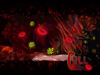
This was a concept paint of the environment "Heart Chamber" where the boss would be encountered.  I was focusing on clear materials definitions for the environment artists, suggestion of propulation assets, and clarification of the red blood cell powerups and the virus mine enemies.  It was done wholly in photoshop, in about 3 hours.  Later, after I made the Cell logo text, I converted the paintup to a 'wallpaper' format as you see here. 


It happened January 25th- 27th, so I'm a little late in posting up the meaty bits associated with the efforts.  Reasons?  Doing a 48 hour event pushed a lot of things behind by about 48 hours!  After that there's been some family medical emergencies, and work that is under NDA....but I've been noodling away. 

If you every get a chance to do a GGJ, do it.  Anyone is welcome, anyone interested in game production at all.  There were even two boys, 13 and 14 I think their ages were, at the Pittsburgh location who set out to code an entirely text based team.


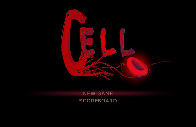
This concept was trying to feel out the opening menu screen and whether we wanted custom font or just to use a premade font.  We liked the effect, animated the blood cell throbbing with a heartbeat sound, and went with it.


I took on the role of Producer for an outstanding team, as well as a Concept Artist, Game Designer and Texture Artist.  Producer meant collecting files and holding meetings, being the final decider on directions discussed, keeping everyone to deadlines, and most of all keeping cool, calm and collected while encouraging team enthusiasm and health.  By the end, concept and UI work complete,  I was putting blankets over sleeping teammates and telling others when they'd been working for more than 2 hours straight to stand and have a 5 minute walk and water break.


Our Team logo, NoBrows.  It's a stylized portrait of Travis.  Apparently at some point he'd lost a bet and shaved his eyebrows as a result long prior in history.  So our team wagered him his eyebrows if we won any awards.  It became a running joke over the event, and the logo was a surprise to get him and everyone to laugh.  It worked well.  Sadly, he still has his eyebrows in real life.

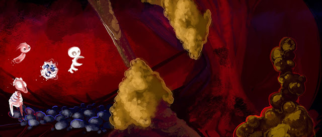
Some early iterations of White Cell's design over top of a vein/artery environment concept.  With only 48 hours, I was trying to cut down by combining the environment, propulation and character on one piece.

My excellent, talented teammates were  - Amanda Wallenhorst, Jordan Jenkins, Cody Wilcoxon, Matthew Kline, Travis Kehler, Kyle Hickey, and Theresa Liddington.  This year's theme was a heartbeat, and we had decided early on that we wanted to make a side-scroller in the Unreal Development Kit.  Cue the canonball run collection adventure of White Cell, who fights to free your heart from the grip of Cardiovascular Disease. W, S, A, & D guide the character along the environment to collect red blood cell power ups, and players have to be careful to avoid the exploding viral mines.  The product came out beautifully polished for 48hours and 8 sleep deprived artists, and everyone who played it commented on that aspect. 


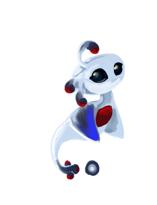
Our Stylized main protagonist, White Cell.  


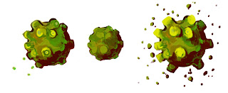
The enemy virus mines and some indication of how they should animate to the skinning/rigging team.

We discussed wanting to maybe spend another week jam session on it as a group, figuring if we got that far in 2 days, a dedicated 7 might allow us to push in a projectile attack, some other interesting enemy variants, expand the 'boss battle' and have more than one level.  I really hope we can organize it together.  As the Producer, I suppose that will be in my court to start emailing everyone!

In the meantime, All GGJ participants upload their source files and playables to the GGJ site, and agree to released them under Attribution-Noncommercial-Share Alike 3.0 version of the Creative Commons License. So go play our game, Cell, as well as all the other amazing 48-hour free vignettes created by this amazing event!

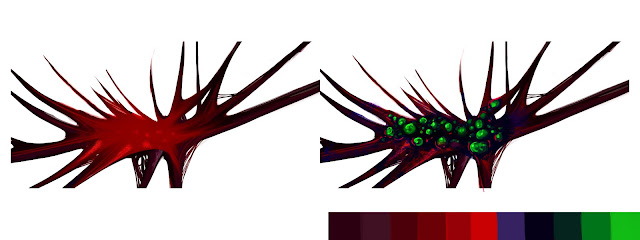
The base palette we decided to use as well as a prop concept in a infected and non-infected state of texture swap.


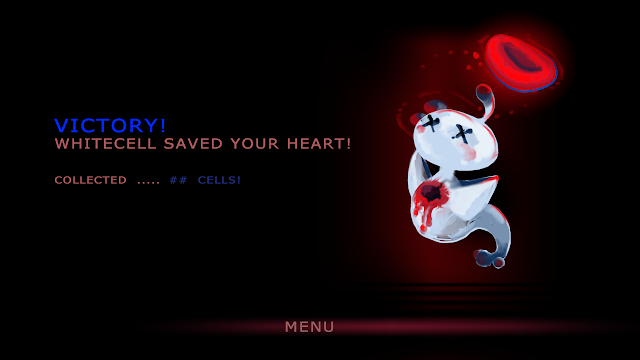
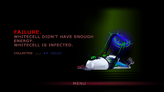
Spoiler?  WhiteCell is based on a basophil immune cell, so win or loose, he has excreted his defensive chemicals to poison/eat the enemy and perishes.  Its a glorious sacrifice to save the body and become a hero.  If he loses....poor thing gets infected.

We even had suggestion that we should have WhiteCell plushies made, with the hole in their body still there, looking cute and gore. It was great people got into the ambiance and feel so much, and really liked the style.


Followers

Labels

concept (17) sketch (15) character (12) design (11) Rough (10) game (8) environment (6) props (6) competition (5) commission (4)
Art © Kit McLellan. Powered by Blogger.

About Me

Illustrator, writer, and gamer (analog/old school or digital). Omnigenre-interested and prepared to creative jam with whatever the lovely muses of the world offer.

Feel free to grab a cuppa, chat, and contribute.